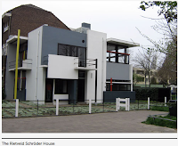
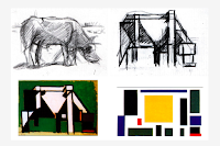
 The meaning behind these movements was to create an “utopian idea of harmony and order.” Reducing elements down to their simplest forms reduces critiques which can appeal to a larger demographic regarding interior designs for stores and frequented fast food restaurants. A key element revolving around De Stijl was that form met function. This is a key component for interior design and even more so, mass produced interior design.
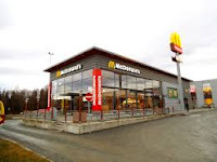
 As someone who has stared at the wall and the floor of many fast food restaurants, geometric figures are key muses in décor. This Dutch movement became the beginning of the phrase, “less is more”. Clean, straight, and geometric shapes are a key design strategy of Macdonald’s restaurants. Additionally, they also use rich primary colors to attract consumers. Red and yellow are all colors that induce hunger as well as featured colors in Peter Mondrian’s, Composition with Large Red Plane, Yellow, Black, Gray, and Blue. Red and yellow also happen to be recognizable logo colors for McDonald’s branding. Marketers and designers want to attract customers in their target demographic of the business, when that demographic is broad, simplified designs are the only way to go.
A few years back, McDonald’s underwent a remodel of not only their brand but, their interior design image. Even the simplest designs can become simpler. Formally recognizable with patterned white and black wall tile addressing the family demographic to adopting a simpler café design. Both designs utilize De Stijlstyle, yet the style is updated to fulfill the needs of the target demographic to keep customers coming back. Mark Moeler, The Recipe of Success, stated, “If things stick around too long it becomes wallpaper. We all get bored with wallpaper after a while.”


Comments
Post a Comment